ShopDreamUp AI ArtDreamUp
Deviation Actions


Suggested Deviants


Suggested Collections


You Might Like…


Featured in Groups

Description
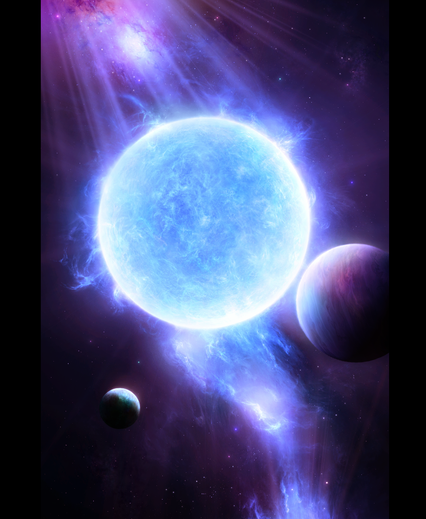
Latest work.. ah, not very realistic, I know  (Smile)")
Enjoy and thanks for looking.
 My artwork is not stock and it is not to be re-uploaded, edited, or used anywhere in any way without my permission. Please respect that, thank you!
Enjoy and thanks for looking.
Image size
877x1068px 1.08 MB
© 2009 - 2024 synax444
Comments269
Join the community to add your comment. Already a deviant? Log In
<img src="e.deviantart.com/emoticons/h/h…" width="15" height="15" alt="
I'm not sure what edits you have made, but the planets look pretty darn good, but I think you should change the lighting angle if at all possible on the right one. I get the impression it is being lit from a light directly to it's left, so it appears to me to be 1/50th of it's diameter away from the sun <img src="e.deviantart.com/emoticons/h/h…" width="15" height="15" alt="
<img src="e.deviantart.com/emoticons/m/m…" width="15" height="15" alt="
The blue star looks great effects wise, but I still feel like it's slightly flat in the center, though I'm not really sure how that could be changed.
The background effects are supurb, I really like your galactic clouds and the stars, very well done (they seem slightly sparse to me, but it's better to err on the low side in my opinion <img src="e.deviantart.com/emoticons/t/t…" width="15" height="15" alt="